The three-quarter view of a heroic locomotive thundering down the mainline surrounded by billowing smoke is an enduringly popular one, but how can graphic design make railways look cool?
Personally I’m a sucker for modernist design, the elegant use of typography, simple shapes and a well-selected colour pallet. I love the precise elegance of brand guideline documents, where each letter is perfectly constructed and the colours perfectly matched – an oasis of ordered tranquility.
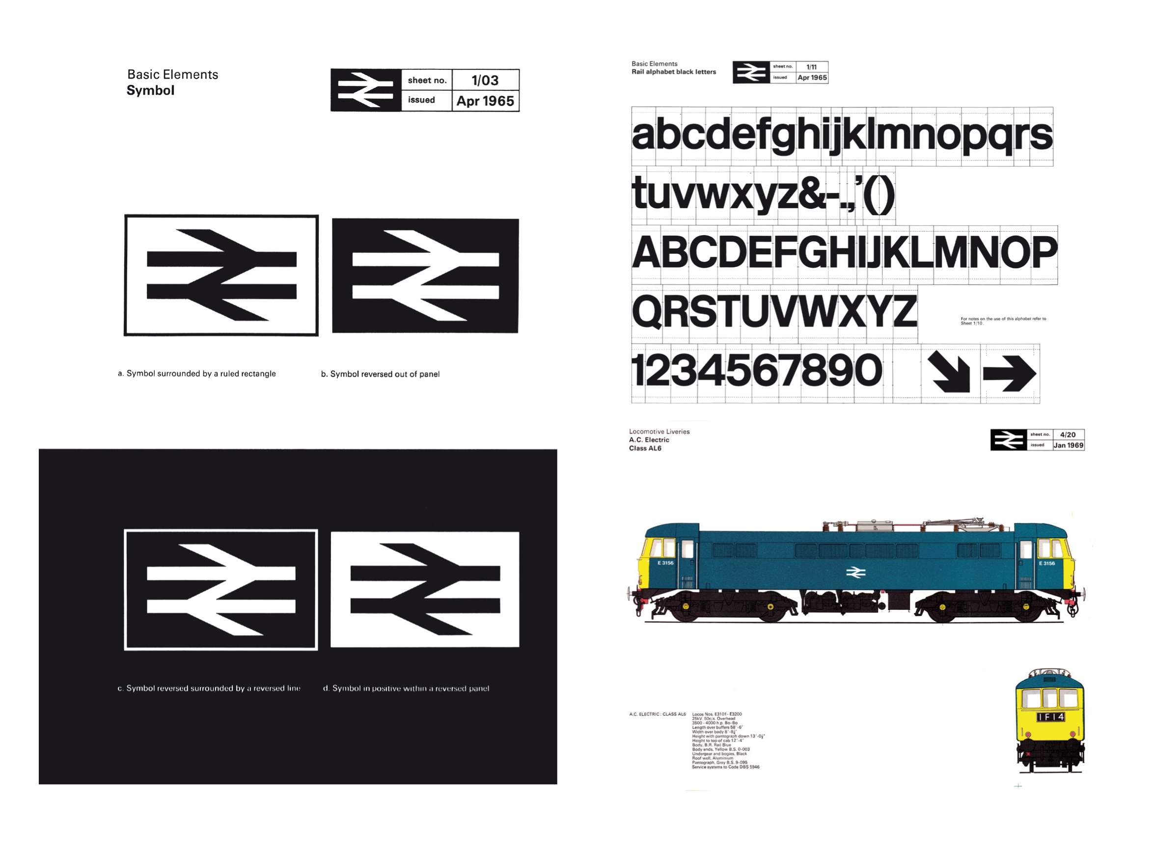
The British Rail Corporate Identity Manual lists page after page of the precise breakdown and use of their logo, and includes their ‘Rail Alphabet’ font designed by Jock Kinneir and Margaret Calvert. It sets out how the brand should be used by Travellers Fare, Sea Link and Freightliner lorries, and instructs on its use in everything from posters to the livery of a Class AL6.
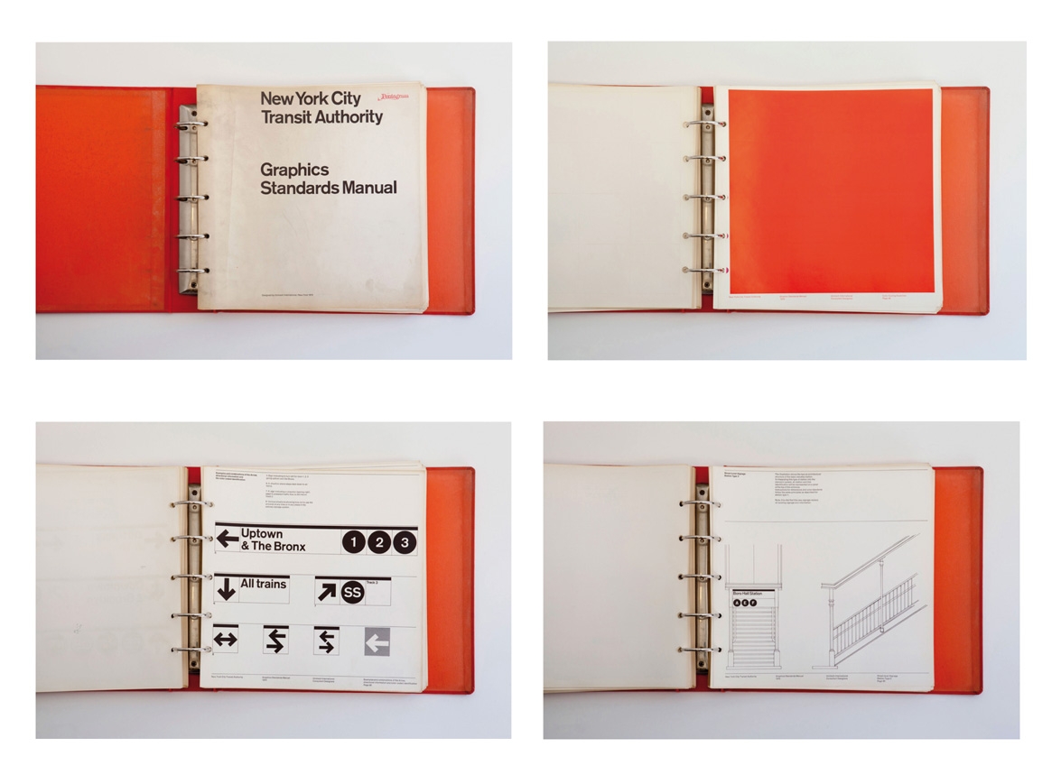
Another wonderful example of branding is the New York Transit Authority Graphic Standards Manual. Endless pages are dedicated to a celebration of each letter of their alphabet, and full page washes of brand colours are reminiscent of a Mark Rothko painting if he’d been given one tin of Dulux and asked to neatly paint a wall. The manual includes examples of signage pointing the user off page towards ‘Uptown’ or ‘The Bronx’, and show how signs would look when displayed at the bottom of the stairs to Boro Hall Station.
Subtly isn’t a dirty word. It feels more like listening to Kraftwerk’s Europe Endless from the album Trans Europe Express


The British Rail Corporate Identity Manual looks like a very interesting publication to collect. Mus try to locate one.
The NYCTA Graphics Standards Manual was a visual system that worked perfectly and seamlessly with Massimo Vignelli’s famed New York subway map of 1972-79. The current map doesn’t mesh well with the graphics system still mainly in use, but Vignelli’s map has been making a comeback, with a refresh being utilized most notably for “The Weekender” map. Personally, I wish the Transit Authority would use the new Vignelli map all the time.